anti
.
anti .
Anti – Brand Identity for a Copywriting Company
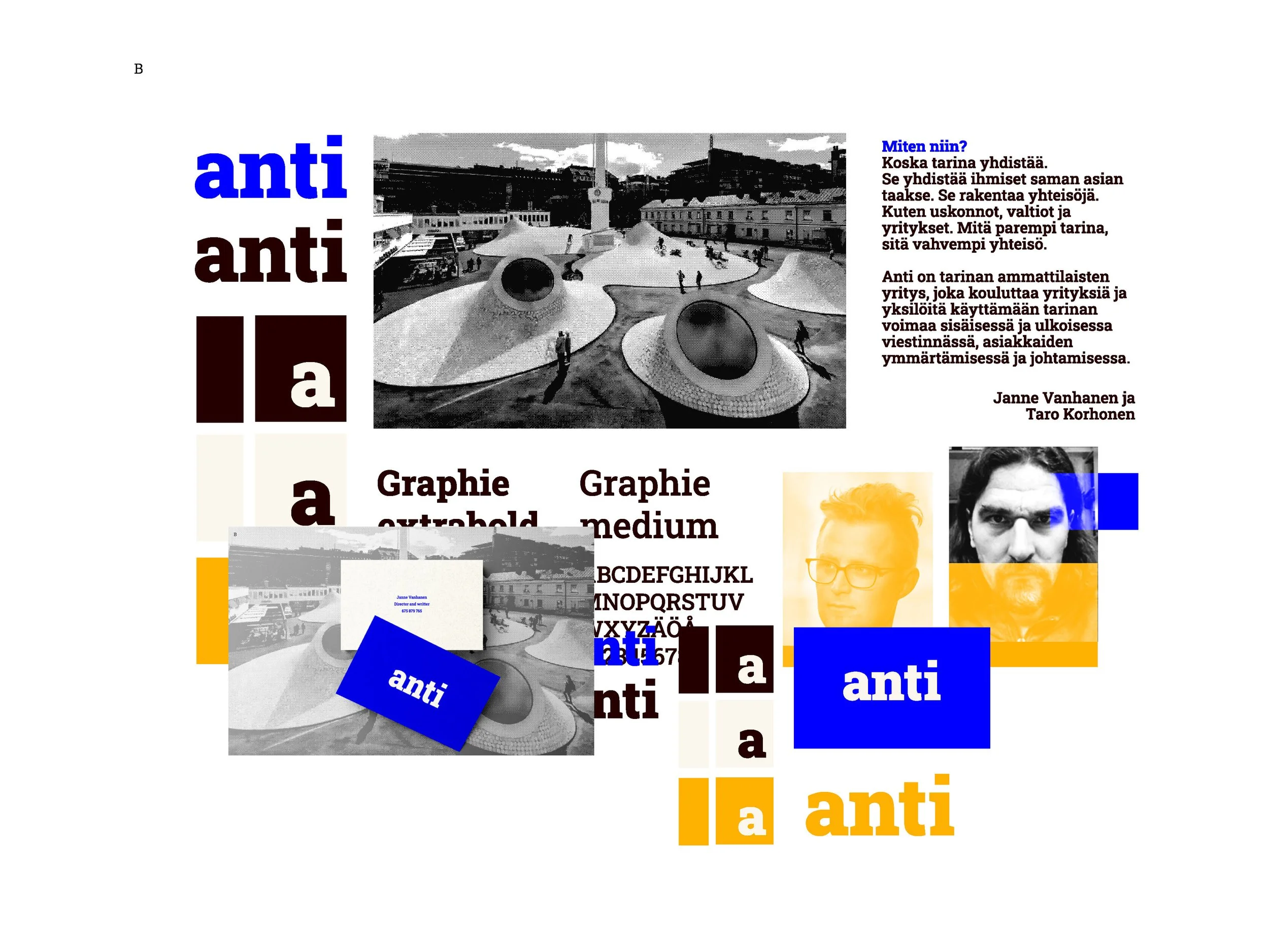
This project was developed for Anti, a Helsinki-based copywriting company founded by advertising professionals Janne Vanhanen and Taro Korhonen. The goal was to create a visual identity that felt modern, stylish, and smart, while staying approachable and grounded in a genuine love for books and the written word.
The brand development unfolded over a month. Together, we explored three distinct narrative directions—two more contrasting and one in a neutral, more balanced tone. The final identity reflects a harmony between professionalism and creative edge.
The logo was designed as a contemporary filigrana—a kind of signature mark that is both instantly recognizable and easy to animate across various formats. Supporting visuals borrow from the world of editing and publishing: graphic elements inspired by text correction symbols, a print-like texture reminiscent of rotary press, and backgrounds echoing the warmth of paper. The color palette stays minimal and effective, with red, black, and off-white as its core.
More images from the process…


